N

-

-

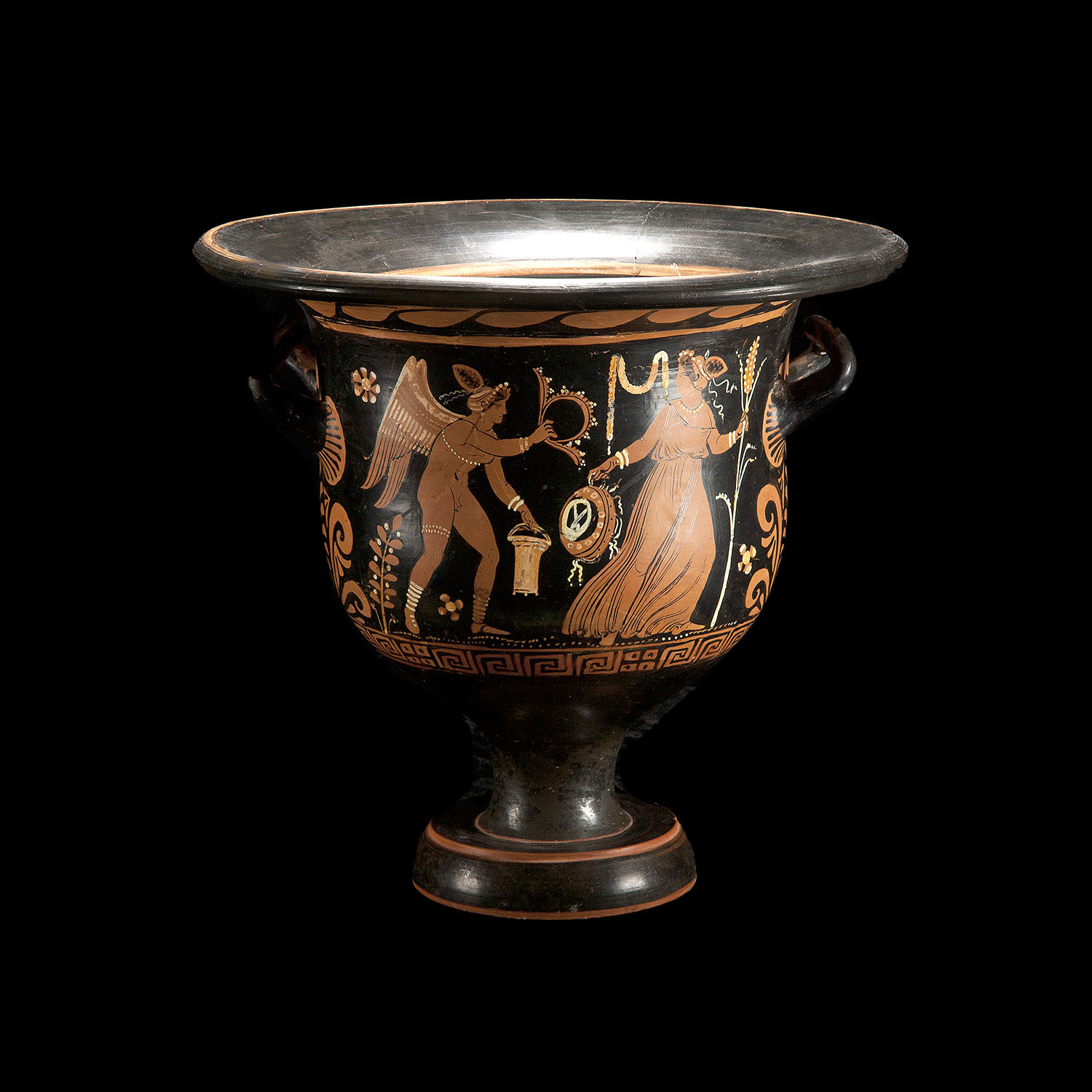
Desire to be a vessel of honor unto the Lord Jesus Christ?
Join For His Glory for a discussion on how
https://christianforums.net/threads/a-vessel-of-honor.110278/
-

-

-

-

Taking the time to pray? Christ is the answer in times of need
https://christianforums.net/threads/psalm-70-1-save-me-o-god-lord-help-me-now.108509/
-
