Photographs My Design Work

  • Thread starter Thread starter an_activist
  • Start date Start date
A

an_activist

Guest
I am a graphic designer. My pieces are very abstract. I use alot of definite shapes, retro color schemes, and alot of filters to give my pieces their unique look. Below is a piece a did by taking a photo of my sister's Guinea Pig and used a couple of different filters in Photoshop.

technicolorcavy.bmp
 
I like the color, but the very sharp text "unbalances" the top and bottom.

Often, a small, detailed area works played against a large, less detailed area, but it works better in a left/right format. I'd be interested in seeing what it would do if you reformated it that way.
 
Love the colors, but am not too terribly excited about the text as well.
 

What is that pic about? Sorry, but I didn't get the meaning.
I'm sorry to say but I don't like that color. It's sharp and unpleasant for eyes to look at.
I hope you are not offended by this and I suppose that we should be honest with each other.
May I ask you a question?
Where did you learn graphic design?
 
You have achieved a very interesting effect. I think you need to lower the background to a more neutral color......being a graphic artist must be so much fun....not enough contrast....

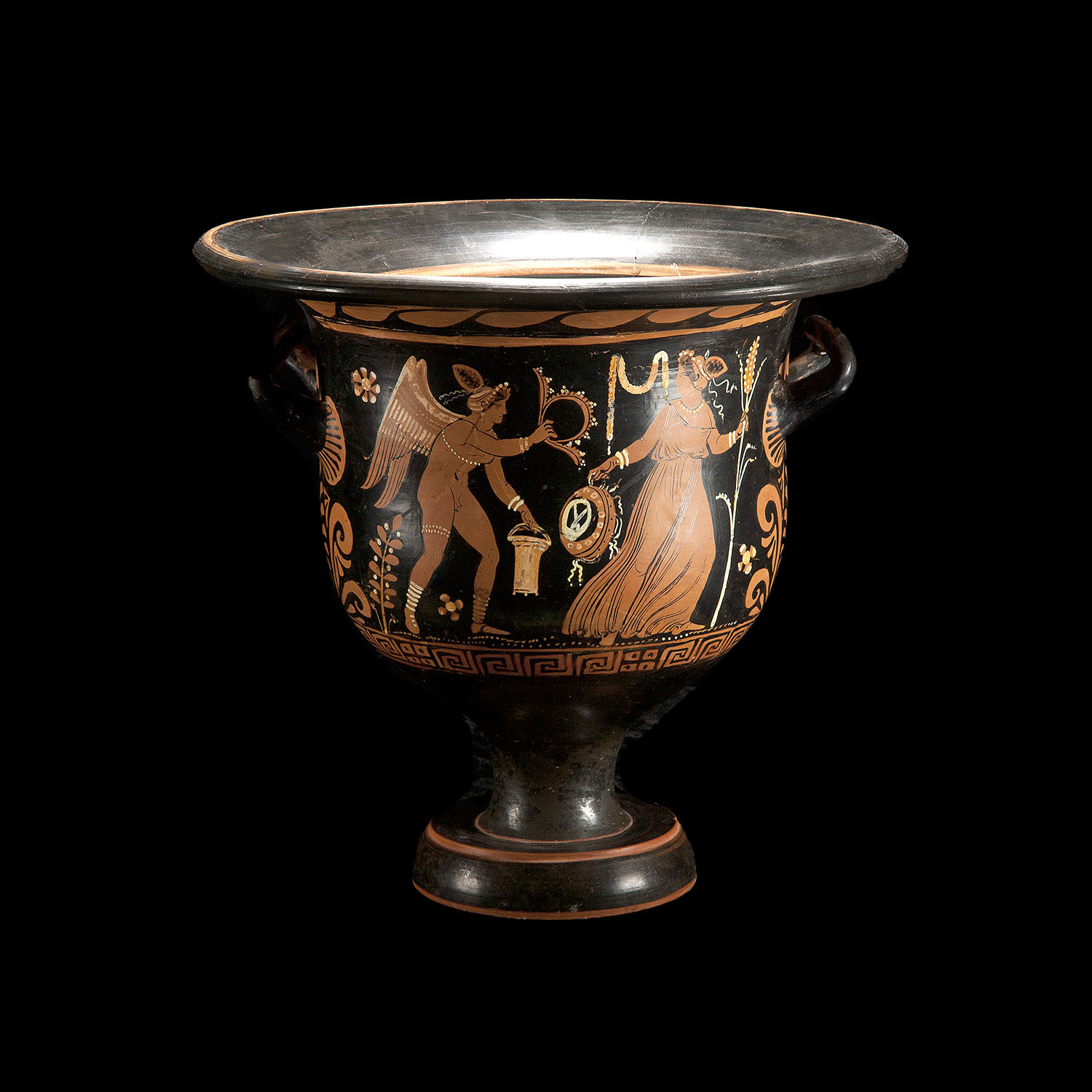
I do a lot of handbuilt pottery in unusual shapes (I like to take a piece and make it look like it imploded) in the tradition of George Ohr, the mad potter of Biloxie, Artist...... so in a sense that is graphic art......in dirt... :-D Keep it up....and I wish you many happy accidents. Most of my best peices were the result of something I did by accident. :)


1108484088985_ohrs_pot_sch.jpg
 
I thought you might like to see this grapic I made of my cat Abe.

1105866694242_abe_graphic.JPG
 
Back
Top